Logo Design: It’s the Small Stuff the Counts
We see it everywhere: logo design. It is present in advertising and marketing, entertainment, and even the company letterhead on the memo you just received at work. Since we can’t escape it, we might as well learn more about the importance of logos, and the small details of this artform that help to change the face of the world’s leading companies. First, we must ask ourselves, what exactly is a logo?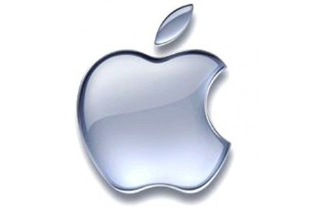
Typically, a logo is a graphic, emblem, or even just an organization or product name. However, what is more important than the logo’s makeup is what it does. From the start, the purpose of logos is to create instant public familiarity with the organization or product that the logo represents. For example, you are probably familiar with a logo that shows the silhouette of an apple that happens to be missing a bite. Though this logo has nothing to do with orchards or already used farm produce. Yet, the design is almost inseparable from one of the most successful technological companies in the world: Apple.
But what of the small details in logo design that supposedly make all the difference? Well, let’s just say that when it comes to company or product branding, uniformity is key. The more consistent all branding aspects can be, the stronger the overall marketing will become. Some of these design details in logos can be as simple as using the same tone of green as a single stripe of paint on your product. Or, in the case of Google, the important details of a logo might be as minute as issues of shading.
Google’s Changing Logo Design
On September 20 of last year, Google announced a new navigation that features, you guessed it, a changed logo. Didn’t notice any change in the “Google” logo design? That’s no surprise. As we’ve been discussing, the reason for that is that the adjustment to Google’s popular brand face was minimal.
Simply by changing font from beveled letters with bold coloring to flat letters with comparatively muted tones, Google performed a great deal in unifying its brand scheme. According to Google’s Tech Lead and Manager, Eddie Kessler, the new flat logo will create a seamless brand for its users. The flat logo is part of the broader branding theme Google recently took on. Characterized by geometric shapes, specific fonts and even proportions, a distinctly two-dimensional approach is another feature in Google’s new branding designs.
To learn more about logo designs and branding, please feel free to browse other materials offered by Farotech, or contact us to find out how we can design a logo for you.
The post Logo Design: It’s the Small Stuff that Counts appeared first on Farotech.
source https://farotech.com/blog/logo-design-small-stuff-counts/
No comments:
Post a Comment